ShopDreamUp AI ArtDreamUp
Deviation Actions


Suggested Deviants


Suggested Collections


You Might Like…


Featured in Groups


Description
Edit
Minor adjustments were made and the website is online (Smile)") Paulhoman.com!
Paulhoman.com!
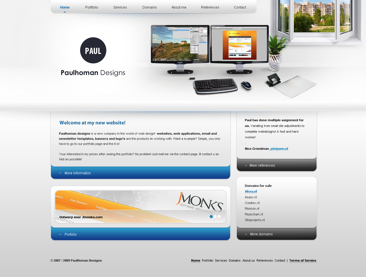
In the search to a new look and feel for my company im working on some different concepts. To find out wich is the best im hoping to get your oppinion on it.
About the style
thinking about what-to-do-know I was looking and walking circles in my room.. And suddenly I had this idea, why not have your own workingspace on your website! So I basicly tried to make a working space in the header. The screens are the same as im using right now, same goes for the keyboard and mouse and the paper Plant and the window are stocks i bought.
I'd love to hear your oppinions!
Please take a look at concept 1 also!
Minor adjustments were made and the website is online
In the search to a new look and feel for my company im working on some different concepts. To find out wich is the best im hoping to get your oppinion on it.
About the style
thinking about what-to-do-know I was looking and walking circles in my room.. And suddenly I had this idea, why not have your own workingspace on your website! So I basicly tried to make a working space in the header. The screens are the same as im using right now, same goes for the keyboard and mouse and the paper
I'd love to hear your oppinions!
Please take a look at concept 1 also!
Image size
1280x971px 375.38 KB
© 2009 - 2024 PaulNLD
Comments100
Join the community to add your comment. Already a deviant? Log In
I love the top of the page... just masterpiece bro!! it looks great just like a real photo <img src="e.deviantart.net/emoticons/s/s…" width="15" height="15" alt="